Strategic Color Trends for Brand Identity: A 2026 Design Brief
The Core Palette: Anchor Shades for Market Stability
From a brand management perspective, core colors provide the “Blue Chip” stability of your visual identity. These shades are designed for longevity and cross-platform versatility.
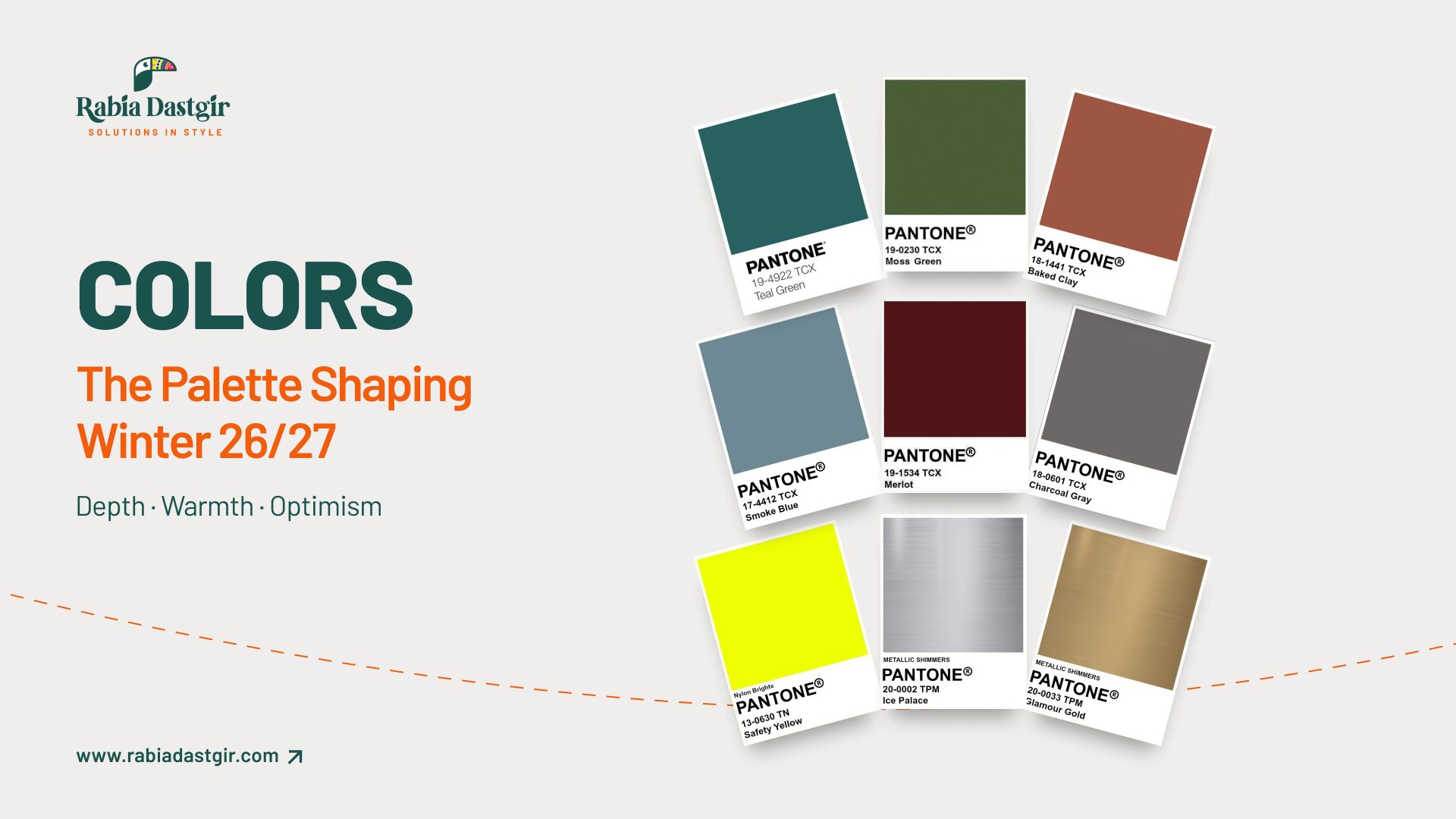
- Transformative Teal: This deep blue green hybrid offers a sense of fluidity and technological sophistication. In a corporate context, it serves as a modern alternative to navy, signaling innovation without sacrificing trust.
- Smoky Jade and Moss Green: These muted, heritage tones lean into the sustainable business narrative. For apparel and packaging, they communicate environmental responsibility, a key factor in contemporary ESG (Environmental, Social, and Governance) reporting.
- Olive Brown and Earth Clay: These grounding neutrals respond to the consumer’s desire for authenticity. In marketing, they provide a “human-centric” backdrop that softens high-tech brand messaging.
- Charcoal Graphite: A base neutral that offers more depth than standard black. It is the color of industrial precision, making it ideal for luxury hardware and minimalist brand architectures.
- Rich Burgundy and Oxblood: This palette represents the “Premiumization” trend. Historically associated with wealth, these tones are strategically used in evening apparel and high-end lifestyle branding to drive perceived value.
- Powder Blue and Dusty Sky: These shades provide necessary contrast. In marketing psychology, soft blues are proven to reduce consumer anxiety, making them excellent for service-based branding and UX design.
Executive Insight: Effective branding requires “Color-Brand Congruence.” According to studies published by the Harvard Business Review, the “appropriateness” of a color for a specific product category is the most important factor in purchasing intent.
Accents and Metallics: Driving Consumer Engagement
If core colors are the strategy, accents are the tactics. These elements are designed to capture “Share of Ear” and “Share of Eye” in a crowded marketplace.
- Brushed Gold and Copper: These highlights add a layer of “Tangible Luxury.” We apply these in hardware and embroidery to increase the Total Quality Management (TQM) perception of apparel lines.
- High-Shine Silver and Chrome: These metallics signal a digital-first, futuristic mindset. They are essential for brands looking to align with the “Sport-Lux” and “Meta-Modern” aesthetic trends.
- Neon Citric Pops: Used with surgical precision, these “Action Colors” serve as Calls to Action (CTAs). In digital marketing, they guide the user’s eye to high-conversion zones, as discussed in recent Journal of Marketing Research case studies.
The RDDC Strategic Advantage: Beyond Aesthetics
At RDDC, we recognize that color is a multi-dimensional asset. Our consultancy provides a holistic approach that integrates these trends into:
- Apparel and Product Design: Ensuring your physical goods reflect global CMF (Color, Material, Finish) standards.
- Marketing and Communication: Using color psychology to enhance brand recall and emotional resonance.
- Brand Identity Systems: Creating a “Brand Bible” that ensures consistency across global markets and diverse demographics.
For more on how we integrate these principles into large-scale projects, you can explore latest research on the psychology of color in business growth.
Strategize Your Brand Evolution
In a volatile economy, your brand’s visual equity is one of your most valuable intangible assets. Don’t leave your color strategy to chance. At Rabia Dastgir Design Consultants, we combine expert level business acumen with world-class design expertise to ensure your palette performs as hard as your product.
Is your brand identity optimized for the next market cycle? Partner with RDDC to develop a high-performance visual strategy. Contact us for a comprehensive brand audit.


